Friday 4 April 2014

Final Evaluation

Overall I feel that during this Unit I have come a long way with regard to my skills using Photoshop as well as my understanding of it and how it can be used to benefit graphical work of various natures.

When I began with the Firefish tutorial (which ultimately turned into a 'Moonfish') I learned the very basic tools and concepts. Below is a re-post of the finished tutorial picture that I made.

The picture was made almost entirely by creating and manipulating work paths. During this tutorial I didn't yet realise how to save work paths, so I ended up having to re-make a lot of paths that were altered or lost in various ways. I did, however, successfully work with layers as just about every section of the fish was a on a different layer. I found it such a natural concept so I picked up on it immediately. I also used the gradient tool a lot to fill paths and learned the use of layer masks. An example of where a layer mask was used is on the background moon (the original image is a full moon). I created a plain black background layer which I put at the bottom of all other layers, so when I added a layer mask to the moon the 'Moon Shadow' effect was made. On hindsight, having now knowledge of even more tools, I realise that I could have improved the fish with the use of the blur and smudge tools.
Another aspect I learned about is the importance of canvas size. Originally, I had made the canvas so big (by accident, I still don't know how I managed) that by the time the body of the fish was done (before the smoky wisps and the moon) the file was over 6GB in size. At this point it took about 20 minutes to save the file and at one time it even blue-screened the computer. This was one of the first lessons I took forward to the task of logo creation, ensuring that the canvas was a very modest size in comparison.

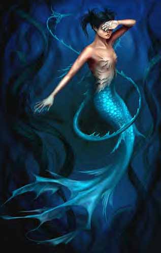
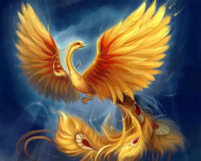
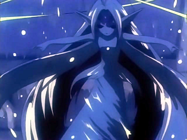
With the artwork that followed, I further practiced and improved my skills with Photoshop. Here are some of the images I made.

With the plane image, I used the select tool to select most of the background, and then refined the selection to make sure that the plane was not affected to get rid of the background. I used the plane to create a custom brush. Then I added a drop shadow onto the plane itself, and used the brush to make the coloured shadows. I originally intended to use this in the presentation about graphics concepts, but then decided against it since it obscured other images.

With the collage, I had three images to work with: 'pen and mouse', 'pro cameras' and 'scanner and photocopier' images. From the last two, I only removed the background to make sure it was transparent (like with the plane). But with the pen and mouse, I had originally tried to find (and failed) an image of a graphics tablet pen instead. So I decided to use Photoshop to try and disguise the ballpoint pen to look more digital. This is where I learned to use the blur, sharpen and particularly the smudge tool. With the smudge tool, alternating between 'Normal', 'Darken' and 'Lighten' settings, I got rid of the ink cartridge inside and fused the button to just look like a solid end.


 With my logo designs and character designs I mostly used work paths (which I quickly learned to save and re-use). These were filled with either solid or gradient colours, then layer effects such as drop-shadows or glows added. I tested a lot of different effects, especially with the logos, which I found I could manipulate to create various effects. I found many that worked well together and some which don't. I stumbled on some really cool effects by accident, including the version of the Fenix logo where the bird was in the foreground and the feather was behind it blurred out in the background (looking like a watermark).

While I felt the logos were fit for purpose in that they explored several different possibilities and ideas and then worked with them, I realised along the way that I personally did not enjoy working with minimalist graphics. With many of the logos I commented that while I thought they looked good and enjoyed the way the design had turned out, I did not believe that it would work in practice very well as a logo. This being because many of them have a sort of level of detail that will be quickly lost if the image has to be printed very small (such as part of a letterhead or business card). However, when I managed to get a logo to be simple enough to work in practice as a logo, I did not personally like it very much (as was the case with the first and simpler 'Moon Games' logo which was just the drawn ellipse). It was too simple for my taste and so I didn't personally like it much.

As far as skills and understanding of Photoshop go, I feel that I have come a long way during this Unit. I feel that I have found a new, powerful and infinitely useful tool with which to work in the future. I had tried approaching Photoshop (and its derivatives) in the past. But since I'd gotten used to MS Paint style applications, I found that I didn't have the correct mentality to fully understand the ways in which Photoshop works and approaches images. But overcoming the first learning curve in this unit, I feel like I can now go on successfully to find and practice the more complete array of advanced tools that Photoshop has.
I also got an enormous amount of satisfaction out of the last task (creating the mage character) as I found that a task which used to take me hours and hours by hand (colouring in line art) was not only faster with Photoshop, but it allowed me the safety of non-destructive editing, a luxury I have not been able to afford when drawing by hand.

I don't feel that my skills are close enough to be considered 'professional', but I do feel that I'm at a level of ability now which exceeds what I was able to do before and has brought me closer to the ability to create beautiful and professional images. And it has given me a good starting point from which to move forward.

Concept Art

I created some concept art for a character and costume designs for the game idea 'aValon'.

Here is the final work.


The character was drawn quite simply and the line art filled with block colours. As the deadline was looming, detail was kept quite minimal. However, due to the simple 'Chibi' style of the character I felt that the colouring technique actually complemented the style quite well.
In the future I would like to try adding shadows and highlights, however I could see the game being built around this sort of style. Possibly the characters could be drawn in this most simplistic style, while environments could have a greater level of detail, possibly with artwork resembling that of Yoshi's Island.

If I had the chance to take the project further, I would want to try adding shading to create depth to the character as well as varying costume designs and colours. I would want to create 4 categories of character much like in many RPG fighter games, which are 'Mage' 'Warrior' 'Thief' and 'Monster'. The Mage would be adept at magic mainly, Warriors could use a large array of weapons, Thieves would have low-damage move-sets which would cause various status ailments and special effects and Monsters would be able to summon creatures and be good a unarmed combat. I would also like to tinker with character designs for sort of 'evolutions' of each character similar to the Final Fantasy I mechanic.

Overall I feel the character design is fit for purpose as it is because it does communicate the idea of the costume design, however there are a lot of graphic improvements I'd like to try with the character.

Logo Choice

The final logo chosen to use for the company was this:


The reason was that the logo had was simple; used interesting colours and displayed the company name clearly.

Friday 28 March 2014

Moon Games Logo

This was the only logo for which I did not make an initial sketch, because I felt like working with simple curves and swirls and hence this could be easily made directly with photoshop.

Here is the first version I made.


With this version, I made a simple curve path which I then added a brush stroke along. This was the 'glow' or 'sheen' of the moon. Copying the path shape, I simply completed the same path to make an elipse shape that I added a gradient to, using a deep blue colour fading to white. The font I used was Broadway, which was already installed on the system.
I like this version a lot. I think it gives a very simplistic feel similar to photos of where the sun just peeks over the edges of the earth and lights it up. The logo could also work in print and black and white as there isn't much fine detail.

The look of the logo made me want to try using a real image of the moon. Here is the next version I made.


This was the only logo where I superimposed my other shapes onto an actual photograph. The image of the moon, "Moon Shadow" was taken from www.freerangestock.com and is not subject to copyright. The original artist is Beverly Omalley.
Using the blur and sharpen tools, and alternating between the 'darken' and 'lighten' settings,  I enhanced the image by blurring the outer edge and clearing up the features on the surface. Then I superimposed the company name from before and gave it a drop shadow as well as emboss effect to set it off from the background. I created a 'swish' which I filled with a lilac colour. Then I reduced the layer transparency to 30%. Then I found a four-point star online and used it to make a custom brush, with which I added stars onto the 'swish' (on a new layer). This was to make it look like glittering moondust.
I really like the look of the image, but I'm not sure if it would work as well as a logo as the previous version. This is because of the fine detail on the moon as well as the smaller stars in the moondust. However, in electronic format I would consider that this version was the better.

Friday 21 March 2014

Valkyria Games Logo

I made three versions of the Valkyria Games logo.

Here is the first.


I filled the body of the helmet with a grey colour and then added a texture to it, which made it look like battered metal. For the red swirls, I used the gradient tool and a deep crimson and bright scarlet reds. This created a 'shine', after which I added a drop shadow to make them look engraved for contrast. For the feathers I was playing around with the blue gradient, but then noticed that it looked quite 'cartoony'. I added a stroke effect around the edge, which gave it an unexpected but nice looking manga-style look.
I don't think the metal texture would work in a logo (because the detail is too fine), but I do like how the logo looked overall. The contrast between the three different aspects works in a disjointed kind of way. In other words, I felt that they didn't really work together, but in a way that lends itself to a sort of theme which ultimately does work. I didn't add the company name to the logo though, which makes the helmet look a bit 'stranded'.
I was really fascinated by the manga-look I accidentally found for the feathers, and decided to try changing the look of the helmet to accommodate that better, as well as testing the incorporation of the company name.


In this version I added the same effects I used in the feathers to the helmet: I replaced the metal pattern with a yellow-to-orange gradient as well as adding an additional shape to give it the 'gleam' at the front. I changed the inner shadow in the red swirls into an emboss effect and added a glow.
I think stylistically this works a little better, and the simplicity makes it more workable as a logo. But as per the look, I think I preferred the first version a bit better. However, the logo is considerably better now that the company name was included.
I wanted to try one more version, which would be much more simplified and focussing more on the name as opposed to the image.


This was the last version which I made. I decided to get rid of the helmet and instead focus on the feathers that I had liked so much. I also decided to keep the smaller swirls for interest and to fill the white gap left between the feathers and the words.
As a logo, this was my favourite. Being very simple, it still felt very iconic. However, due to the shape of the feathers, unfortunately the valkyrian look was lost and honestly I think the image looks more like a chief's headdress. This relates a much more Native American feel for me, in which case I might consider playing around with either the company name and/or the shape of the feathers.

Friday 14 March 2014

Sunanoo logo

For my Sunanoo logo I made three different variations.

Here is the first.


Just like with the other logos, I started by sticking very closely to the original sketch. I stayed with similar colours as with Mer, but this time I gave the character a slight blur to make her more 'airy' as such. I also added an extra whisp (the red one) to add the red colour which I was planning to have. The font for the logo is Aniron, which I downloaded from www.fantasyfonts.com.
Here what I did was give the font an emboss and drop shadow to highlight it. I also gave a slight emboss to the red whisp, effectively making these two elements the foreground, while the maiden with the blur effect became the background. I like this effect, but I'm not 100% if this would work as a logo.

Here is another version, where I tried to make a more compact logo.


Here I literally extracted the name and the red whisp, using a layer mask to fade out the part of the whisp that wrapped around Sunanoo's waist. I think as a logo is already works a bit better, but I feel a little like the meaning would be lost without the body of the girl. If this logo were used, I would probably recommend this be used in tandem with the fuller version. This compact version could be used on game cases and letterheads, while the full version could be used in presentations and posters.

I had another idea for a compact logo, which is the following.


Here, instead of using the red whisp, I edited the wire path of the tail wave and the colour of the text. This version might be my favourite. I changed the light blue into white and removed the blur, and gave the wave a small drop shadow. I think the contrasting colours work well together.

Fenix logo

With the Fenix logo I came up with quite a few different versions to test different ideas I had.

Here is the first.


With this I went with the original ideas of using reds, oranges and yellows to create a fiery theme. I used an outline on the phoenix body and wings to make it look a little bit like a cartoon. I gave the feather an outer glow and satin effect again to try and make it glow a little bit like embers.
I think this turned out alright, but considering how the logo might be used I have concerns over how well the feather might be visible especially in print.

Later on I messed around with the colours being used and made some changes to the feather. I thought it might look good in this version, so I came back and tried it out. Here's what this first version looked like with the change.


I think this looks a bit better. The use of the dark colours in the feather remove the issue with the visibility. First I just superimposed the crimson feather onto the previous satin one to give it a little bit of glow. Later I removed the satin feather altogether.

Here is the next version.


With this one I decided to test changing the oranges and yellows out for a white. I exchanged the feather for the company name and added an emboss effect to everything. The font I used was Colonna MT, which was already installed on the system. For this version I felt that perhaps it was a little more 'clean' than the previous. But here is a little bit of an issue with the visibility of the 'F'. Changing it to white didn't really seem to help anything, so I decided to keep it black. I did try to overcome this by moving the text away from the bird, but this made the two elements look awkward in how they stood apart.
I felt that this perhaps worked better as a logo, but I would still have concerns over visibility.

Here is the next version.


This was perhaps my favourite version. The dark colours deleted problems with visibility. It was here that I first made the dark version of the feather, and then decided to try mixing it with earlier versions to test the look. Witht the bird, I decided to use an inner shadow to augment the colour theme and make it 'sink' into the background.
I left the satin feather underneath the dark feather here to give it a glow and hence a lighter outline. I felt that this was necessary to make sure that its outline didn't effectively fuse with the phoenix.

Here is the next version.


This version came about mostly again from messing around with the dark feather and earlier versions of the logo. Here when I added the crimson feather to the white-red emboss phoenix, I had the idea that it might look better if the bird was superimposed on the feather rather than vice-versa. I added a blur effect to the feather to make it look a little like a watermark.
With this verison, as a piece of art I perhaps like it the best. I think the feather in the back looks really good and has a very nice effect. This would be something I think would look fantastic as, for example, the watermark on corporate letters. However, as a logo I think this doesn't work although not necessarily because it doesn't look good. I think issues with visibility and print are the worst with this one. I don't think the individual elements would be seperate enough for passersby to quickly pick out the concept in the image.

Following this line of thought and as an attempt to remedy this, I made the following version.


With this I got rid of the bird altogether to try and compact and simplify the image and make it, as mentioned, easier for the casual observer to digest. I rotated the feather slightly to accommodate half of the company name.
I think this works best as a logo, although I don't like how the ripple effect reminds me of Java.

Here is another version following the alternate Egyptian idea I had.


This was the first version I created. This idea was a little fiddly to try and create a sun-like fieriness without reveriting to the red-yellow colours. I decided to add a slightly blurred sphere in the background to be a sun. I made sure the darkest colour in the sun sphere was in its centre, and that the bird's lightest colours were also in its centre. This made sure the bird was easily discernable from the sun.
The company name was in Lithos Pro font, which was already installed on the system. At first I didn't think that the words were terribly visible, so I thought of adding the whisps behind them to try and make them more visible. I used yellow, orange and red to try and simulate the idea of sand. While I do think that the sand effect worked rather well, the whisps felt like an unnecessary obstruction that just made the image messier.


I decided to remove the whisps, and felt that the logo was made considerably when they were gone. However, I think there would still be problems with visibility when the logo was used in print and electronic contexts. If this was explored further, I would experiment with different fonts and font effects.


With this version I decided to try and simplify the bird and rounding off the sharp edges. I superimposed the company name on the logo image. The font I used was Harrington, which was already installed on the system. I changed the colours as I felt the round edges didn't fit the red and yellows.
This is perhaps my least favourite version as I felt the rounded edges made the bird look more like a fairy cake than anything else.

Out of these I would say my favourites were the red-yellow bird with the crimson feather, the crimson bird and the compact feather/company name logo.

Beyond these, I had A LOT of ideas with regard what to try to improve the look. Many of these were with regard to slight changes in positioning and layout and colour combinations. However, due to time constraints, I decided to stop here as I felt I had a nice rounded roster of variations.

Friday 7 March 2014

Task 2 -- Interactive Images, Their Uses and Aspects

In today's world, graphics are everywhere. While the advent of computer technology discouraged graphics, due to its initial text-based existence, once GUIs were developed the number of and quality of graphics began to increase.

To begin with, it is clear that the web is rife with images and interactive features. Austerity in a website must be a carefully considered organisational theme, not the result of ineptitude of the design or development departments. Not only that, printed promotion, movies, many software and games all utilise high-end graphics (though only the last two could be considered interactive).

Interactivity is an eagerly sought commodity. Programs which request user inputs and change their outputs based on what inputs are entered are interactive. Games are a good example of this, and the technique of giving the user multiple crossroads to choose from which will determine the flow of the story is becoming more prevalent.

But the use of graphics isn't a simple matter of just having or not having them. Not all graphics are created equal, and so not all graphics will suit the same need. There are many aspects that need to be considered when capturing and editing graphics for a specified purpose, because it is the use and purpose that the image is being made for that will determine many of these factors.

Picture Quality vs File Size
Typically the balance between quality and file size will be determined by the context of the image's use. These are determined by the resolution of the image as well as file type.
High resolution TIFF files might possibly look the best, however if the images are meant to be for an online product catalogue, it will be far more important to keep the file size to a minimum. TIFF files contain much data about the image, like layers, and are barely compressed so files tend to be large. JPEG images on the other hand are very compressed, and while the quality of the image may suffer slightly, the small file size is much more appropriate. It may also be necessary to shrink the images themselves to the smallest possible for use in context.
However, for something like a game or a poster, the file size typically is not as imperative as the quality of the image itself. For this, PNG file types may be more suitable. There may also be a requirement to maintain the resolution at a fairly high minimum.
A company like Square Enix, for example, put a great deal of effort into ensuring high-quality graphics with high attention to detail. For them, the quality of the game assets is clearly paramount to the time taken and often leads to the size of the software being considerable.

The difficulty in predicting the suitability of various file types, resolutions, capture and storage methods lies in the fact that these are heavily influenced by the resources at hand. What storage space does the company have? What software does the company use (some file types may not be compatible)? What storage space will the ultimate user/viewer of the image need? How much money and time is available to spend on attaining a particular quality of image, and how imperative is the quality?

How useful an image can be is affected further by how its is captured. Photographs taken for websites are typically stored as JPEGs when they are captured. JPEGs render very high quality images with low file size when used this way (and in fact, few other file types perform as well here). However, game assets created or drawn in Photoshop should probably be stored as TIFF images instead to ensure that relevant data is retained about them.

How an image must be captured or generated and later stored is defined by what the image must be used for. As seen in previous examples, the simple factor of whether the image will ultimately be printed or not already makes a major difference to what matters when the image is being edited. Hence being fully aware of the ultimate purpose and use of the image is key.

Below is a slideshow review of the key points of interactive graphics.


Mer Logo

I created two different versions of the Mer logo.

Here is the first version I created:


In this version, like with Suijin, I stuck very closely to the original sketch. However, with this logo I really wanted to go for a very hard, metallic feel. To that end, I used a gradient fill between a very dark and very light blue and did not use an outline. Then I added a very stark shadow to add to this effect. The name I added was in Aniron font downloaded from www.fantasyfonts.com.

I liked the metallic effect and the dark blue, but the name felt a bit disconnected from the image. So I wanted to try another version with more attention on the name.
Here is the other version I made with a vague idea taken from where I went with the Suijin Logo.
I wasn't all that happy with this version but I thought it was worth a try. I tried to make a more compact version of the logo which retained the oceanic symbolism. It did look more compact, but still there was something kind of clunky about it.

I didn't have any more ideas at the time, so I decided to leave it. But I want to come back to this one later on to see if  I could just edit this a little more and bring out the effect I was hoping to get.

Friday 28 February 2014

Suijin Logo

The next logo I completed from sketches was 'Suijin Games'.

Here is the first version I made.


With this version I stuck quite closely to the original shape and design. I stuck mainly to blue, being a watery colour, and made some background shapes in 'silver' and turquoise, which are auxiliary colours. I liked the wave at the end of the character's 'tail' so much that I made the separate extra waves to try and bring it out a little. I also used a contrast of inner and drop shadows to create a contrast of embos and engraving. I added a similar effect to the font, which I really liked.
The font I used was Endor from www.fantasyfonts.com.

Overall I think the logo worked out alright, and would definitely say I preferred it over the Agrona logo. But with so much attention on the wave of the tail, I wanted to try making a simpler logo with just the wave as an image. Here is the first alternate I made.

I took out the bottom-most layer with the turquoise-black wave shadow and changed the font (mainly). The new font is called Fairydust, also from www.fantasyfonts.com. I also made an effort to separate out the two words of the logo. I really like the effect made by making the first word dark and the second light, with the wave as a background. I felt that this somehow worked a lot better than the first version, but I felt like there was a little something missing and I could make it even better, so I added a few tweaks. Below is what I came up with.

I was happiest with this version. I didn't change the font this time, but I removed the 'tails' of the waves with a layer mask and added the dark blue and white 'swivel' underlining the word 'Suijin'. I feel that this made the overall image more compact and focused, with just the right amount of interest on both words.

Agrona Logo

The first logo that I made into a 'final version' was the 'Agrona Shield'.

Here is the final result.


I made the 'shield' diamond below the cross green and the cross yellow and orange to make it look a bit golden or bronze. These two colours complemented each other as well as communicated a Celtic theme. I used a gradient of purple for the detail to make them relief, and for extra effect I gate the 'cross-jewels' an inner glow. For the font I chose the Aniron font, which I downloaded from www.fantasyfonts.com.

Overall I am happy with how it looks, but not super excited about it. While the logo would definitely look good on screen, am unsure as to how the small detail would affect the overall look if it was shrunken to 100x100 px for example, or smaller. If used as a logo, it might be necessary to make a plainer version for use in small print.

I had no other ideas as to what to do with this, so I didn't make other versions.

Wednesday 26 February 2014

Quick Idea

Based on the initial phoenix logo sketch which I uploaded, and while watching a program online I had a third idea with regard to a company name and the use of the logo.
 
The idea of the name would be Egyptian God Phoenix. This would still communicate the theme of the company's aims, which are elegance and mythology/fantasy.
 
The shape below would still be used, but instead of reds I would use a gold gradient. This would still communicate the idea of fire but also the colour of sand.
 

Friday 21 February 2014

Concept Logos

These are the concept sketches that I made by hand which I will use from here on out to create the logos. They will act as the base for the logos and subsequent forms.

Fenix


This was the idea for the phoenix logo which would be combined with the text of the company name. Below is a sketch of the feather for the second version idea, where instead of the company name the feather is superimposed on the phoenix instead.


Mer


The Mer logo idea was drawn in the same style as Suijin and Sunanoo but with more of an emphasis on resembling submarine life or creatures.

Suijin


Suijin and Mer are somewhat similar, but with Suijin I tried to place more focus on implying the idea of the sea rather than a creature living in the sea (which was more of the approach with Mer). This is represented in the image as the tall standing hair (meant to imply wind or rising currents) and the 'tail' ending in three clouds meant to imply waves and sea foam.

Sunanoo


Sunanoo followed along the same style as Mer and Suijin but with the flowing motion I tried to make her imply wind and hence storms more than water.

Agrona


In the shield drawn with a cross I tried to a mixture of shapes, crosses, diamonds and circles to give a medieval feel.

Valkyria


The idea with the helmet was to try and make an image which looked like it had a lot of fine detail yet still remained quite basic. The sharp edges ended up giving the image a very metallic look.

Friday 7 February 2014

Inspiration Images for Logo


These images have been searched for with Google. These images are used for inspirational purposes only and the poster does not claim any rights for these images.
All rights to the original images belong to their respective owners.