To begin my idea search, I did a search for fantasy fonts. I came upon
www.fantasyfonts.com from where I found the following ideas for fonts.
These were some of the fonts I found which I felt could be applicable to the logo. I chose a few to list as the final choice will largely depend on the final logo choice.
Next I researched what Avalon was. According to dictionary definition(
http://dictionary.reference.com/browse/avalon), it is:
"An island, represented as an earthly paradise in the western seas, to which King Arthur and other heroes were carried at death."
Further research found that it has also been thought of as a place of healing and where the legendary swords Caliburn and Excalibur were forged.
Based on this new information, I came up with further logo ideas to play off of this imagery.
Name ideas:
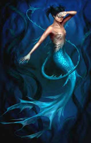
Suijin Games
Reasoning: 'Suijin' is a Japanese Shinto water god. This is another version of the 'Mer' idea, with a similar background reasoning. Also, I thought it would be related through the fact that Avalon is an island.
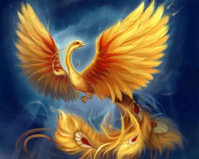
Susanoo
Reasoning: Similar to that of 'Suijin Games' and 'Mer'. Susanoo is the Japanese god of summer storms.
Agrona
Reasoning: The name of the Brythonic Goddess of war (
http://www.behindthename.com/names/usage/celtic-mythology). This was as a subject connection to the game, as it will be a fighting game.
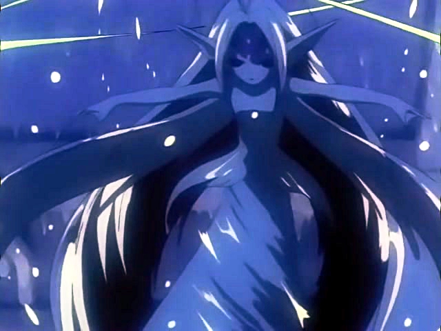
Valkyria Games
Reasoning: In Norse mythology, the Valkyries were battle maidens of Odin who escorted valiantly fallen heroes to Valhalla, the Asgardian Hall of Heroes.
This would be a similar connection as with the 'Agrona' name.
Logo ideas:
(For the name:
Suijin Games)
One idea is to have waves close to the name, which might look like a person (as 'sui' is Japanese for water and 'jin' is Japanese for a person).
(For the name:
Susanoo)
The first concept is to have something similar to the 'Suijin Games' logo idea, but these 'waves' would not only have watery blues and such, but also greys and perhaps some red to communicate the chaos and power of storms.
(For the name:
Agrona)
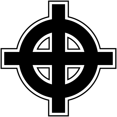
The first idea was to have a simplified Celtic cross next to the name.
Another idea is to have a simple shield with a Celtic cross image on it, behind the letters of the name.
(For the name:
Valkyria Games)
One idea was to have the profile shape of a helmet with three prominent feathers next to the name. This would represent a Valkyrie's helmet.
An alternate version of this could be the helmet silhouette with only the letters VG next to it.
Example sketches to follow...


.full.428935.jpg)


